
Table of Contents
A color palette is a selection of colors used in a design, such as for a website or graphic. They usually consist of a few colors and can give a cohesive look and feel across a plan or create a desired effect. A color palette is like the secret sauce of your life, and just the right combination of hues can transform even the dullest situations into something laugh-out-loud funny. From lime greens to electric blues, your color palette is the best way to add a joke to any case!
UI designers, artists, interior decorators, photographers, web developers, Photoshop experts, 3d modelers, and filmmakers often use color palettes. The tools used to create a color palette depending on the industry but may include color wheels, Pantone swatches, and software tools.
Color palettes are created using color theory. Color Palettes are combinations of colors chosen according to color theory principles of harmony and contrast. The color theory provides basic guidelines for selecting a color palette that has the desired balance of colors and looks aesthetically pleasing.

Significance of colors in design
Colors significantly impact the overall design of a product or website. They can create an emotional reaction, help guide the eye to critical pieces of information, and evoke certain feelings and a desired response.
Colors can be used to differentiate certain elements and certain group features, provide context and set the mood. Cool colors can be used to lower the intensity whilst warm colors can be used to create a feeling of excitement. In marketing, colors can be used to identify products and services or create a brand identity. Colors can help customers to recognize a product or brand instantly.
Light and dark colors should be used according to the available light. For online design, high-contrast colors should be used for visibility and accessibility. Designers can use the color wheel to select colors which work might be too busy.
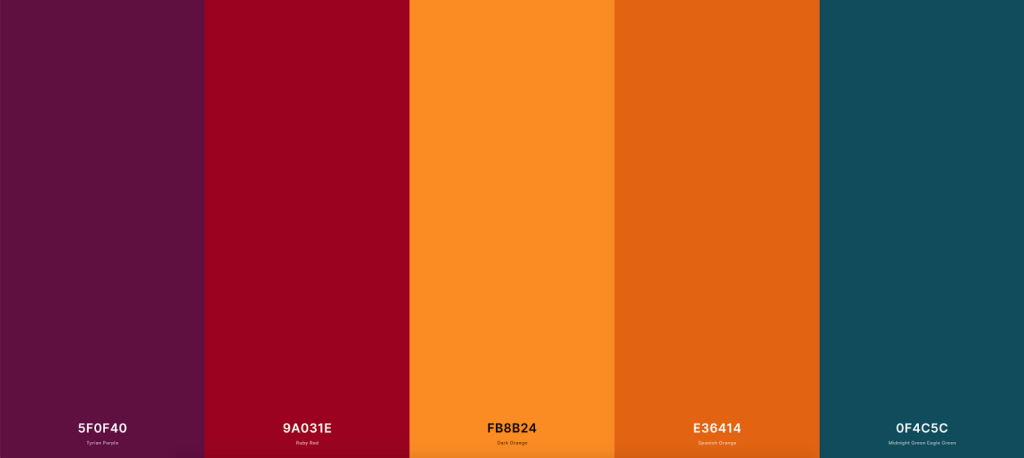
Finally, colors should be used sparingly and consistently across the entire design. A color wheel could help you to find out how to keep integrity. A color wheel is a circular chart that displays the primary, secondary, and tertiary colors. It is often used as a reference for artists and designers to create harmonious color combinations. The color wheel makes it easy to understand the relationships between colors by dividing them into segments based on primary, secondary, and tertiary colors.
Color theory
Color Theory studies how people respond to and interact with color in a visual context. It can include the scientific explanation of color mixing, physiological and psychological effects caused by color, and recommendations for the color used in various applications. Color Theory is the basis for our understanding of color and provides meaningful guidance in using and applying color in the design. Typically, color theory is separated into three main branches: color psychology, color harmony, and color symbolism.
Color psychology and symbolism are the more aesthetic approaches to color. They focus on how colors communicate emotion and meaning, such as warm and cool colors or the associations of a particular color. In contrast, color harmony focuses more on the balance and combination of colors from a visual perspective, such as analogous and complementary color combinations. These areas work together to provide a comprehensive approach to understanding color. Itten color wheel helps a lot to understand color theory.
What is analogous color theory? How does it work?
Analogous color theory is a color scheme in which colors that are adjacent to each other on the color wheel are used. This creates a harmonious and balanced combination of colors. This works because analogous colors contain similar hues and complement each other. Additionally, utilizing a few shades helps create continuity in a design. This can be used to evoke various emotions, depending on the colors and the tones used.
For example, warm hues such as yellows, oranges, and reds evoke feelings of happiness and optimism, while cool hues such as blues, purples, and greens evoke a more calming and tranquil feeling.
How to choose the right color palette for your brand?
When selecting the right color palette for your brand, it’s important to first identify the overall aesthetic you are trying to create. Different colors can evoke different feelings; for example, blues may evoke feelings of calm and trust, while reds and oranges may evoke feelings of energy and passion. Spend some time examining the existing color palettes of well-known brands in your industry and consider making a similar color palette for yourself.
Next, research the psychology of color; different colors have different meanings and may evoke different reactions from consumers. Color theory is a complex subject, so take this as an opportunity to learn as much as you can about which colors match your brand’s identity best.
You should also consider the cultural context of your branding, as different regions associate different meanings to different colors. It’s important to identify the culture you’re targeting and research how they perceive color.
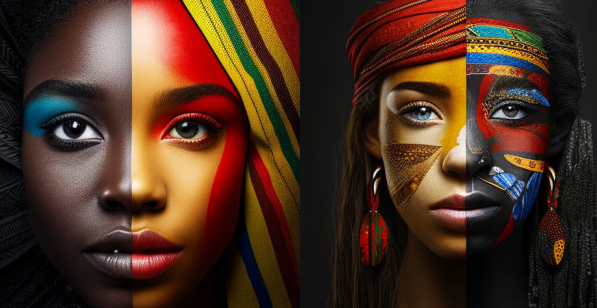
Cultural colors
Cultural context can play an important role in color palette selection. Colors can have vastly different meanings in different cultures, so it can be important to consider what message or ethos you are trying to communicate and to research the best fit for the intended audience. For example, if your target audience is in South America, it might be wise to avoid the color yellow, as this generally carries connotations of mourning or death. In some East Asian cultures, white symbolizes death, and purple stands for wealth, luck, and success. Additionally, research has shown that men and women have different preferences for colors, so understanding your target audience’s gender composition can be useful. Colors can also invoke feelings of nostalgia or familiarity, so if you are looking for a color scheme for a business or organization that has been around for a long time be sure to consider the existing logo or design elements to help determine the most appropriate palette to use.

How color palette could impact your online presence and UX?
• A well-thought out color palette can help distinguish a brand create trust and help to evoke emotions.
• Colors can instantly influence customer perception and invoke specific emotions like thoughtfulness, playfulness, or sophistication.
• Colors can affect a user’s experience on a website. By using a color palette thoughtfully, you can guide users through the website and encourage them to click on what you want them to.
• Specific hues can act as visual cues that lead users to specific calls-to-action.
• A palette of soothing and neutral colors may help to create a calming environment, whereas a stronger palette may evoke feelings of energy and excitement.
• The use of contrasting colors will create a visual flow and guide users to scan and read information quickly.
Tips for enhancing web design
1. Pick a color scheme and stick to it. Choosing a color palette in advance helps to ensure that all of the colors that you choose will work well together and create a unified, cohesive look.
2. Use a color wheel to choose a harmonious color palette. The color wheel is a great resource for figuring out what colors work together and which ones clash.
3. Limit the number of colors you use. Too many colors can become overwhelming and create a messy-looking design. Stick to 3-5 colors for the best results.
4. Avoid pure black and pure white. These colors are often used for text but can create a harsh contrast with the other colors in your web design. Instead, opt for softer shades of gray, like silver or light gray, for a more subtle and attractive look.
5. Pay attention to color psychology. Different colors can evoke different emotions and feelings in people, so choose colors that reflect the message
Color palette making tools
Creating a color palette with online tools is an easy and quick way to create a cohesive look for a design. There are numerous tools available to help create a stunning array of color palettes.
Adobe Color is famous and allows users to browse and refine pre-made color schemes. The color wheel will enable you to choose a starting color and then drag the wheel to create combinations and variations. Colors and COLOURLovers are other great options, allowing you to select a base color and explore different shades and variations with customizable filters.
ColourCode, Pictaculous, and Palettefx are three more online tools that are simple but powerful. Palettefx allows for uploading images and extracting the colors from them. This can be great for creating a unique color palette that is inspired by a photograph.
No matter which tool you decide to use, it’s easy to refine a color palette that reflects the look and atmosphere of any project. sed. This creates a harmonious and balanced combination of colors. This works because analogous colors contain similar hues and complement each other. Additionally, utilizing a few shades helps create continuity in a design. This can be used to evoke various emotions, depending on the colors and the tones used.


